Billing Profile Redesign
The Billing Profile (BP) is a core feature of the MX platform, allowing users to manage advertising campaign billing and budgets. However, its confusing navigation caused user frustration.
As the design lead, I led research and iterative design collaboration to enhance usability.
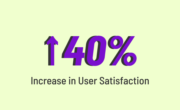
The redesign resulted in a 40% increase in user satisfaction, reduced 5+ design hours, and accelerated the development cycle by 3 days.
Team: 1 PM, 1 Analyst, 5 Engineers, 1 Designer (me!)
Role: Design Lead
Tools: Figma, Jira, Confluence
Date: Jul 2024 - Sep 2024
1. Discover & Define
USER PAIN POINT
“It took me a while to learn how to use the page because it has a lot of complicated questions but no explanations”
BUSINESS PAIN POINT
“How can we increase user engagement
while including all the complex information?”
PRIMARY RESEARCH: HEURISTIC EVALUATION
To better understand the challenges our users faced, we conducted heuristic evaluations. This process helped us identify both surface-level design issues and deeper concerns affecting users while filling out the form.
RECOMMENDATIONS BASED ON PRIMARY RESEARCH
After pinpointing the main design challenges with the current Billing Profile, we found it much easier to create effective solutions that address both user needs and Hudson MX’s objectives. This clarity allowed my team to develop three key recommendations for the Billing Profile redesign effort:
2. Design & Develop
DESIGN ITERATIONS
During this phase, multiple design iterations were shared among team members and key internal stakeholders, including product managers and engineers. Involving these individuals early in the design process enabled us to implement quick changes and updates as needed, ultimately reducing the overall design hours and streamlining the development cycle.
1
Round 1: Concept Sketch
2
Round 2: Low-Fidelity Wireframes
3
Round ∞: High-Fidelity mockups
CROSS-FUNCTIONAL COLLABORATION CHALLENGES
While collaboration among cross-functional team members and stakeholders was essential to the final design and helped restructure our development cycle, the participation of various individuals with differing priorities introduced some unexpected challenges.
1. Competing Priorities
Competing priorities between design and engineering were resolved by leveraging the design system during the Billing Profile redesign, integrating existing components like drawer functionality to align efforts and save design hours.
2. Changing Requirements
To manage shifting requirements, we implemented an agile feedback loop with regular check-ins, allowing us to prioritize user-impact changes and create a balanced roadmap that minimized disruptions while keeping design goals on track.
3. Deliver
REDESIGN HIGHLIGHTS
Clear error indicators, live validations, and actionable error messages empower users avoid making mistakes (click here for demo video)
Highlight #1: Error Support
1a: Added clear error indicators on tabs, allowing users to easily pinpoint errors
1b: Introduced live-validation for quick error detection, eliminating the need to complete the entire form before revealing all errors
1c: Provided contextual error messages with actionable steps to help users resolve issues
Flexible navigation and additional context make completing the Billing Profile page easier for users (click here for demo video)
Highlight #2: Provide Info
2a: Increased navigation choices within the form for improved flexibility and made button labels more intuitive for clearer communication
2b: Added a pin feature for complex questions, allowing users to access relevant details while filling out the form, without losing visibility or switching between windows
Organizing the page into categories with a minimal style enhances the overall Billing Profile (click here for demo video)
Highlight #3: Visual Clarity
3a: Clearly organized questions by category along with brief section descriptions help users stay focused on completing the form
3b: Implemented toggle buttons to hide sections with multiple sub-options, minimizing page scrolling and helping to alleviate user fatigue


